In this blog, we will see how Apple, one of the largest companies in the world, decided to invite others to see the latest updates on their wares.
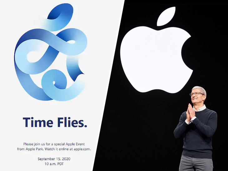

Proximity
The use of the text in the image it’s very clear, simple and tells you everything you need to know to attend to the event; the size of the fount its clearly appropiated, and you can still watching the Apple logo.

Color
I love the use of the color in the Apple logo, it’s a great color to use and it’s the main focus of the announce, so, if you want the attention of the people in your post, you should use the right colors to catch them.
Contrast
Something that it’s amazing by Apple, is how effective they take your attention so easyli and how you get hyped because of the using of the contrast in their images, that’s a very great point that you should take on count.

Alligment
Both Apple logos are on the same level and you can see the bar between the two images representing Apple at its best.
Final thought
In my opinion the good use of this principles may help you to get the attention of anyone that you want, if you can learn how to use it, like Apple does, you may have a very succesfull marketing.
